OK, let's start at the beginning...
Why is a brand so important?
A brand is so much more than just a logo. A brand is also about how we sound, how we act and how we think. Brands can be pretty powerful – they’re the difference between Waitrose and ASDA or ASDA and Lidl. Same goes for Nike vs Reebok or Pepsi vs Coca Cola – simply put, our brand is about what we want people to think and feel when they see HWUnion. So before we introduce you to our brand, it's important that you understand what we're here for, and how we want to act, think and feel - we call this our purpose and values.
So what are our purpose and values?
When we started this whole process, we looked at all our commercial and support services; whether we tried something new or kept doing what worked, everything came back to one key idea. Why the Union does what it does and who for. That’s why we’ve created a really short purpose statement:
Students first, always.
If you look at all the areas of HWUnion, you will quickly see we already put students first in nearly everything that we do. Whether that is providing help and support specific to students, keeping our prices as student friendly as possible, or simply listening to our students to find out what we can help improve.
A big part of the rebranding process was finding how to define what we do, so we decided on some values. If our purpose is what we do, our values show how we do it – or more specifically how people will feel when they’re with us.
We now have five values – three of them are new. They are:
Welcoming
|
We have our arms open wide to any student, no matter their background, culture, viewpoint or needs. |
Fun
|
We want to enjoy the things we do, and we should have fun while we’re doing it. |
Brave
|
We should step out of our comfort zone and try new things – even if it might be a bit risky and fail. |
Empowering
|
It’s not always about fixing student problems, we should be helping students to fix their own problems. |
Student Focused
|
It might seem obvious, but we are the organisation on campus that can truly, always put students first. Let’s not forget that. |
These values underpin the way in which we present ourselves to our students – make sure you discuss them with to find out ways you can demonstrate them in your everyday work.
A little bit about our logo...
With an idea of the purpose and values we held, it was then time to start looking at designs!
We wanted a logo that boldly featured HWUnion that would be recognisable as us and would show community values but not at the cost of the individual’s perspective. The final design concept we all agreed on was “U at the heart of the Union”. The sentiment has a lot of meaning to it, and was taken quite literally when we look at our new logo.
The most obvious part of our new logo, is that it prominently shows the HW of Heriot-Watt, which is made up of the letter U (see how we put “U at the heart” of it!). The U stands for Union, but also stands for “You”, which from our Students’ perspective means them – again we’re putting our students at the heart of our new logo.
You’ll also notice the adjoining and interlocking U’s in H and W – we wanted something to show the community and democracy of the Union, too. The H shows two U’s lifting one another up, the W shows two U’s standing side by side.
It's all about the visuals!
Putting the meaning of our new logo aside for a second, let’s look at the visual impact of our new brand. You will see our new colours are now bright pink and light blue. We’ll also use a bit of dark grey and white as well for contrast. These colours were chosen because they are bright and colourful, easily distinguished from other colours used by Heriot-Watt – and were the most popular choices from our focus groups!
The visual look of our brand doesn’t just rely on the logo but also on these colours. If you see something in bright pink, that’s us!
We wanted the brand to be fun and playful – we’re not a big corporate organisation and don’t want to be seen like that. The colours can be interchanged depending upon what we’re doing – and in some cases we can just use the letter U on its own like in these examples:
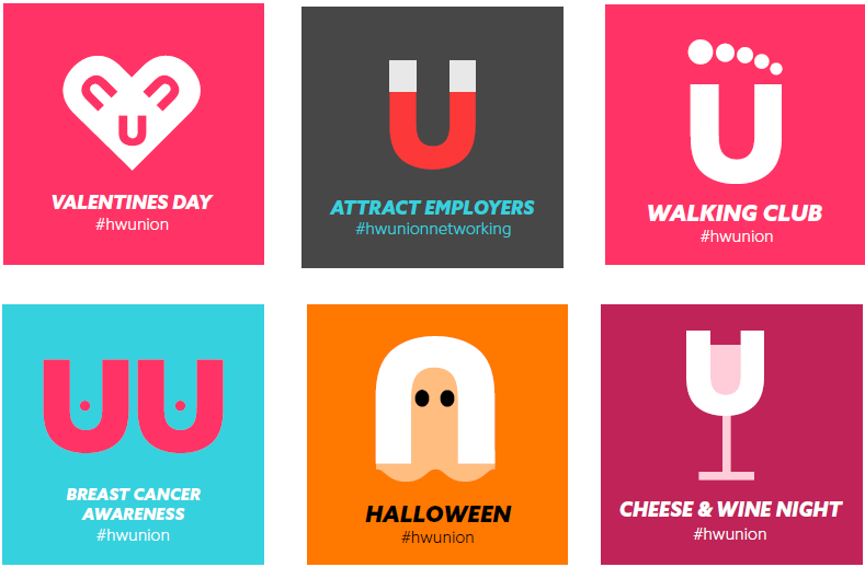
We also want to be able to personalise our brand. Do you prefer the pink to the blue? Whatever you want, we want you to be comfortable in it. You might notice our new office door signs allow the staff inside to personalise the “U” so it lets out a bit of their own personality. We’re even looking at students at SBC designing the logo print on some of our new shop merchandise.
We will also try to use photographs wherever possible, or use icons instead of text. Small elements like these help make us more appear personable and seem more open.
How we sound...
How we speak (whether that’s verbally or in writing) is just as important as how we look. As a quick guide, our tone of voice should be:
- Inviting and enabling dialogue
- Supportive and understanding
- Friendly to everyone at all times
- Lively and informal
- Guiding and showing (not telling)
For more information and some examples of how we sound, see our Tone of Voice section.
The most important part - our people!
We’ve talked about the visual aspect of our brand, and the tone of voice part. The next part is our people – you! We are a very people-centric organisation. We help people, we serve people, we employ people – people are a huge part of our brand. That means you are a huge part of our brand.
Hopefully you are excited and on-board with what our brand stands for. We want you to be proud to be part of HWUnion, and proud to show us off. A large part of that is how we interact with our Students – if we seem happy, we will automatically appear fun and welcoming. If we act positively we will be appear to be brave and student focussed. If we act like we want to help, we will be seen as empowering.
If we are proud to work at HWUnion, we should be happy to let people know we work here. Some staff wear a uniform, which we have also redesigned. We’ve tried to make it less uniformy, and more something you want to wear. We’ve also introduced some different fits so you can wear something you feel comfortable in.
We’ve introduced our new Staff Card which we ask all staff to wear it when you are on shift. It identifies you as part of the organisation, and shows people that they can approach you and you will know what you’re talking about. You can wear it on a lanyard around your neck, or clip it to your belt or pocket.
When you first get your staff card, the space for the name is blank. Pop in your first name and a smiley face, or a flower – whatever you’d like.
How we act...
Remember earlier, when we talked about our values? This is where you can really make a difference and reinforce our brand.
If we were to think about an ideal staff member, who demonstrated our values, we might expect to see the following types of behaviours:
- Supportive and helpful, so if you don’t know the answer to a question you will find out, or point them to someone who does
- Fun and exciting, so you will be motivating and positive, to help keep you and your team around you happy
- Friendly by being welcoming and showing an interest in people - such as students you come in to contact with, and other team members
- Open-minded by being excited about change (such as this rebrand) and finding new ways to do things.
- Ambitious so you will go the extra mile to make us the best, helping HWUnion to become trail-blazers.
Ta Da!
And there you go - thanks for coming on this little journey through our brand. Now feel free to go ahead and use it, play with it, be proud of it. We have loads of templates and downloadables for you to use - and we'll keep adding to them - just use the links on the left.
If you think there's anything missing, or would just like some more information, then email us on union.marketing@hw.ac.uk.
Much love,
The Marketing Team x